Reflection is an API created for the NYU Interactive Telecommunications Program (ITP), where I am a master’s candidate and staff member. Clay Shirky recently called on ITP and NYU to “API ALL THE THINGS.” Well, here goes.
In computer programming, the term “reflection” has a special meaning. Many programming languages cannot inspect or modify the actual code that makes them do what they do. Lack of the capacity for reflection increases a program’s predictability but limits its adaptability to the constantly changing world. But some languages give a program the ability to see into its own operation, and even modify its operation based on what is happening at run-time. This kind of self-analysis and adaptability is the inspiration for Reflection, an API designed to represent the relationships between the people at ITP, and the things we care about here. It is a database schema and web API that stores, presents, and enables querying and manipulation of data on:
- affiliations: e.g. staff, student, class of 1999
- courses: course description, URL, syllabus
- people: name and other identifying info
- projects: e.g. submissions to the ITP shows, thesis projects
- sections: actual instances of a course, including instructors and enrolled students
- tags: user-defined keywords
- terms: semesters and other academic terms
- venues: e.g. Spring 2014 ITP Show
ITP is a two year master’s program at New York University’s Tisch School of the Arts. Though we are unusual in many regards, we have at least one thing in common with most academic programs these days: we create and store an incredible amount of data on ourselves. Over the thirty five year history of the program, and particularly during the last ten years, we have kept data on thousands of people, who have taken thousands of sections of hundreds of classes. Ten years ago, much of this data began to land in MySQL databases that have been maintained as core tools for the department’s day to day administration. As a matter of course during the last decade, we have captured fairly normalized data on all courses offered, all projects presented in the ITP shows, and all thesis presentations required of all graduating students. In addition, course enrollment data is stored, project collaborators are listed, and many projects have user-defined keyword tags. These are the data sources that were identified for inclusion in the first release of the Reflection API. This data is stored within a relational database, and the API itself is a RESTful web API. All interactions with the data are done via HTTP methods, which receive and deliver JSON objects.
From this data, it is possible to map out the social network of ITP, and measure various properties of that network—its interconnectedness, its communities, areas of the network that are uniquely dense/sparse, or to identify individuals or groups who are anomalous in ways that might be interesting to the department’s continual self-examination and improvement. In addition, we can analyze trends in student output and class content, which might serve by proxy as a measure of the corresponding changes in the greater worlds of art, technology, and communication.
But enough of what it might do, let’s look at what we have learned from this data so far.
Projects and Tags
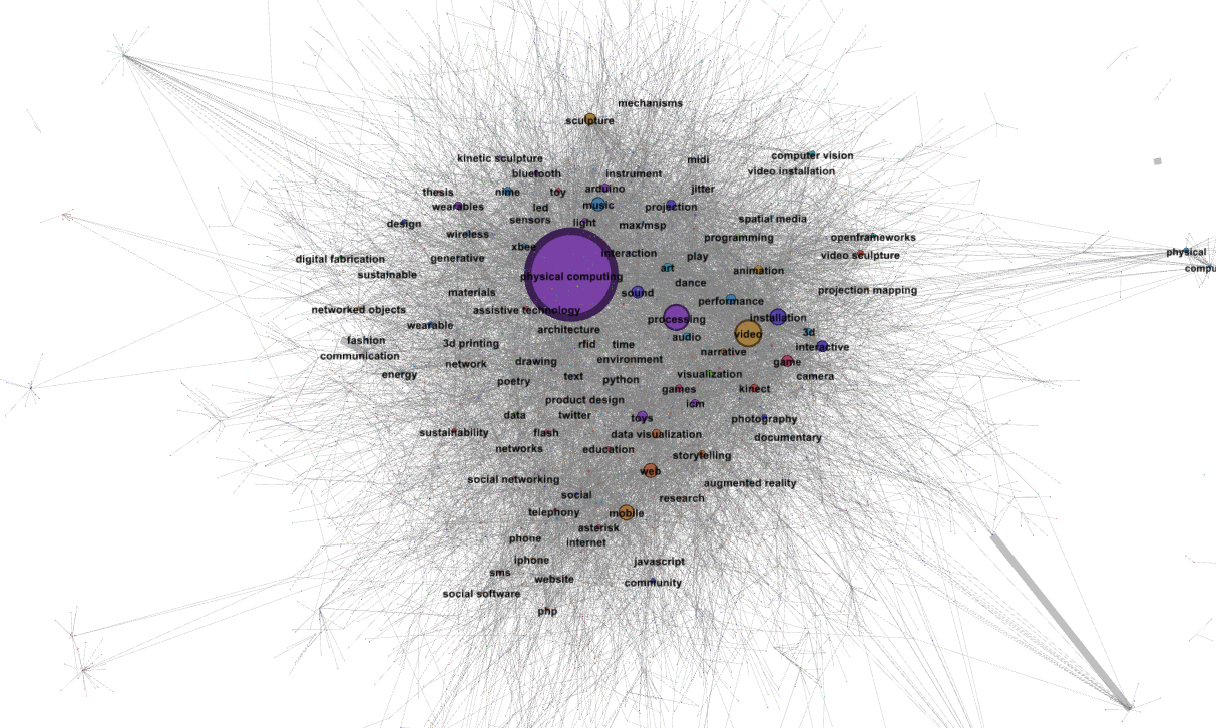
Each student project present in the data can have keyword tags associated with it. These tags are entirely user-defined, with no hinting, so there are a lot of redundant tag names (such as “physical computing” and “physcomp”). However, the lack of hinting is partially beneficial, because students have not been steered toward normalized terms—whatever they thought their project involved, that’s what the tag set probably represents. When a new technology emerges, like “Bluetooth LE,” students are not restricted to using a tag like “Bluetooth,” which would have hidden the distinction.
A bipartite undirected graph was constructed, holding all of the projects and tags as nodes. All project nodes were given a weight of 1, and all tag nodes were given an initial weight of 1. For each tag that a project used, an edge was drawn connecting the project with that tag, and the tag’s weight was incremented by 1. This gave tag nodes a weight corresponding to the number of projects that used that tag. Then a modularity class algorithm was run on the network to find sets of tags that are commonly used together. The result was a large number of what I will call “tag communities.” Here are the top six, with a characterization that I have made of what that community might represent.
Physical Computing, Processing, and Arduino
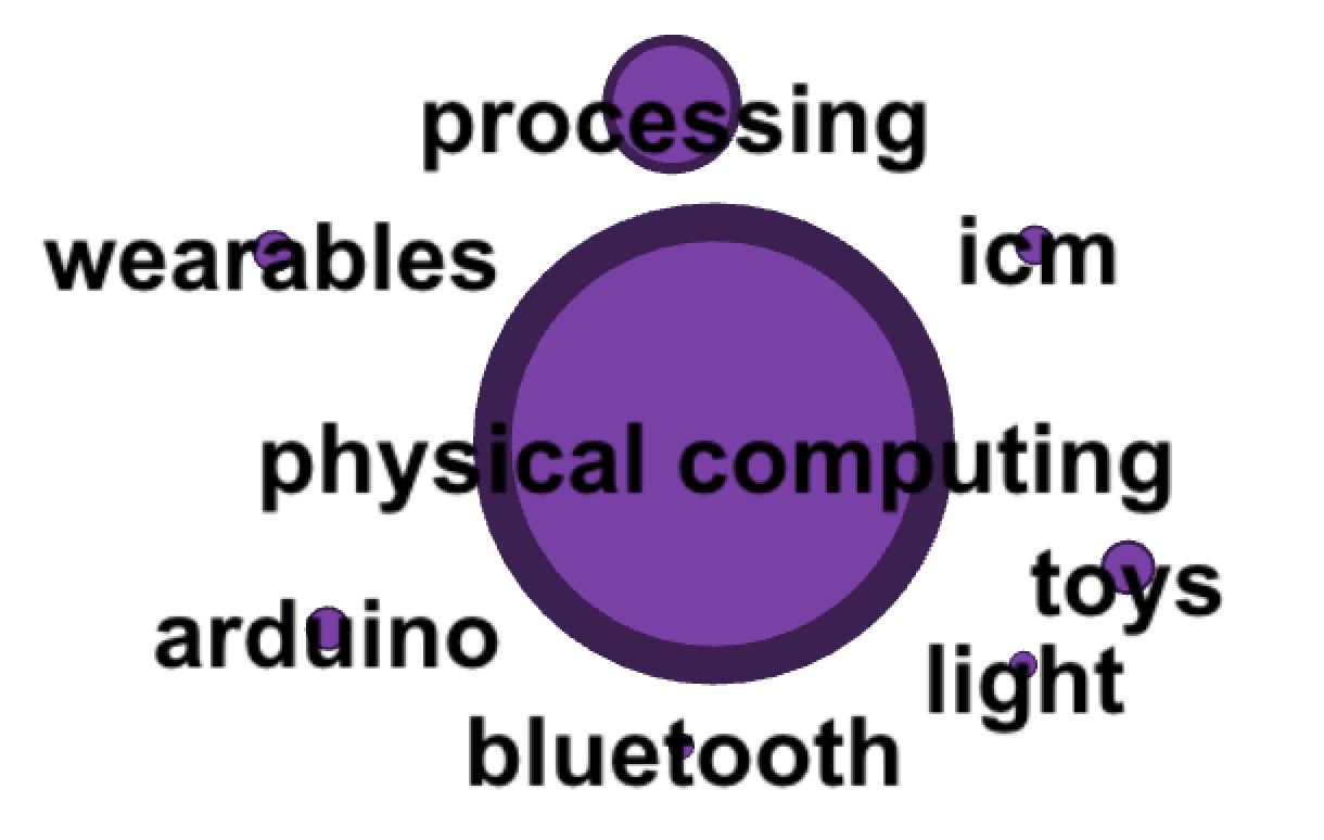 This was by far the largest community detected, and it should not be a surprise that “physical computing” is a dominating tag for ITP projects. The term was coined here, and ITP maintains one of the primary resources for information and instruction in physical computing.
The other obvious tags here are Processing (which is taught to all ITP students in Intro to Computational Media) and Arduino (which is taught to all ITP students in Intro to Physical Computing).
Where it gets interesting is the set of less obvious tags in this community. Students are encouraged to play with technology here, so the fact that “toys” shows up as the fourth largest tag lends some weight to the assertion that play is important here. Other tags like “wearable” and “Bluetooth” show that our projects have been getting the interactive parts of computing out of the computer and into the physical world for some time now.
This was by far the largest community detected, and it should not be a surprise that “physical computing” is a dominating tag for ITP projects. The term was coined here, and ITP maintains one of the primary resources for information and instruction in physical computing.
The other obvious tags here are Processing (which is taught to all ITP students in Intro to Computational Media) and Arduino (which is taught to all ITP students in Intro to Physical Computing).
Where it gets interesting is the set of less obvious tags in this community. Students are encouraged to play with technology here, so the fact that “toys” shows up as the fourth largest tag lends some weight to the assertion that play is important here. Other tags like “wearable” and “Bluetooth” show that our projects have been getting the interactive parts of computing out of the computer and into the physical world for some time now.
Mobile, Phones, and Narrative
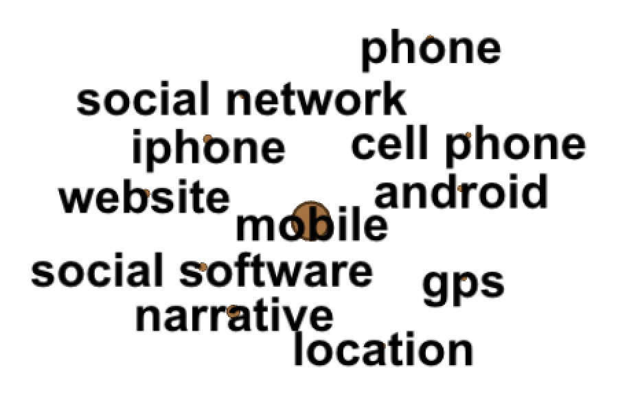 It should be no surprise that mobile devices have been an area of interest during the last ten years. But it is surprising that “narrative” shows up so strongly in this tag community. This may be an artifact of the pre-smartphone era, where voice was still the dominant part of phone and mobile communication. But that’s speculation, in need of future research to further characterize what this data might be telling us.
Video, Sculpture, Animation, and Projection
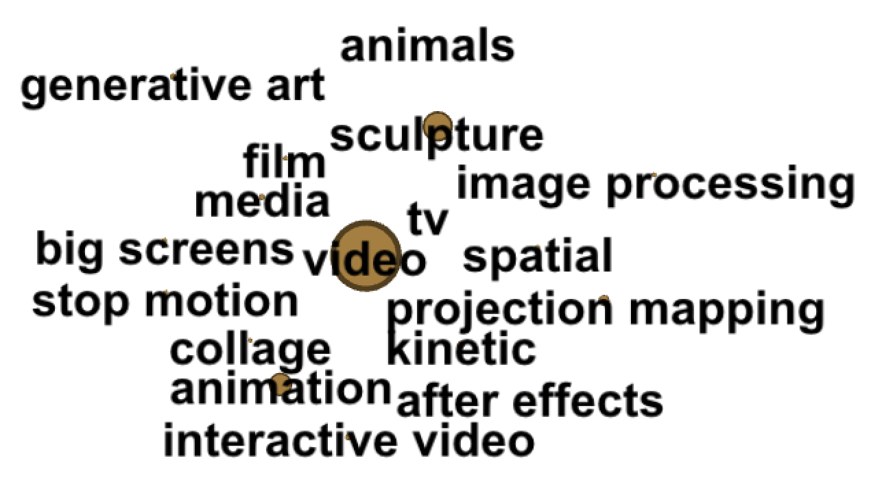 These are the visual arts, which have an obvious home here. But a curious component is the “animals” tag. Again, a point of future research.
Music, Performance, and NIME
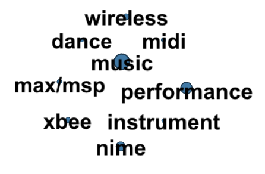 New Interfaces for Musical Expression (NIME) is a popular class offered at ITP each year. Its popularity is clear in the close community of tags around music and NIME, which includes not just obvious music technologies like Max/MSP and MIDI, but also the wireless technologies (e.g. the XBee radio) used in many of the music interfaces created here.
Web, Data, and Storytelling
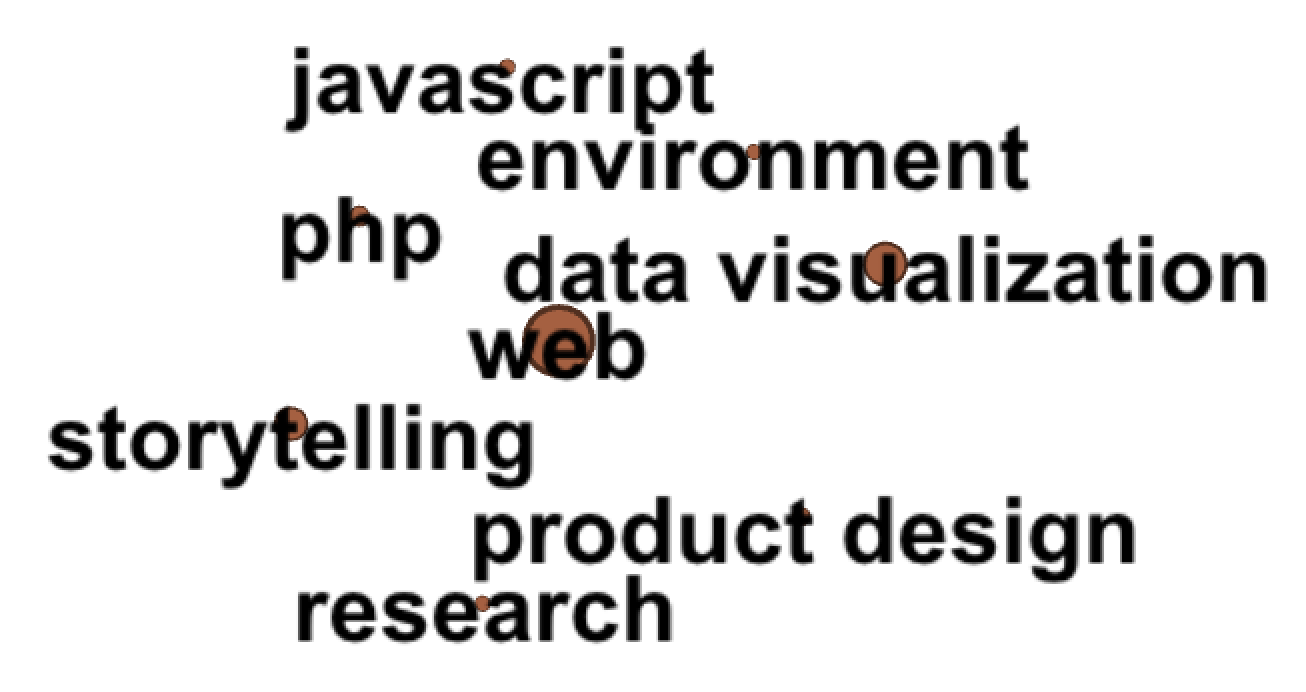 Around the tags “web” and “data visualization” we find some programming languages, but also “storytelling.” Whether the distinction between narrative (seen in the mobile tag community earlier) and storytelling seen here is signal or just noise is another interesting question. Is there something about the web that lends itself to storytelling, while mobile lends itself to narrative?
Installation and Exhibits
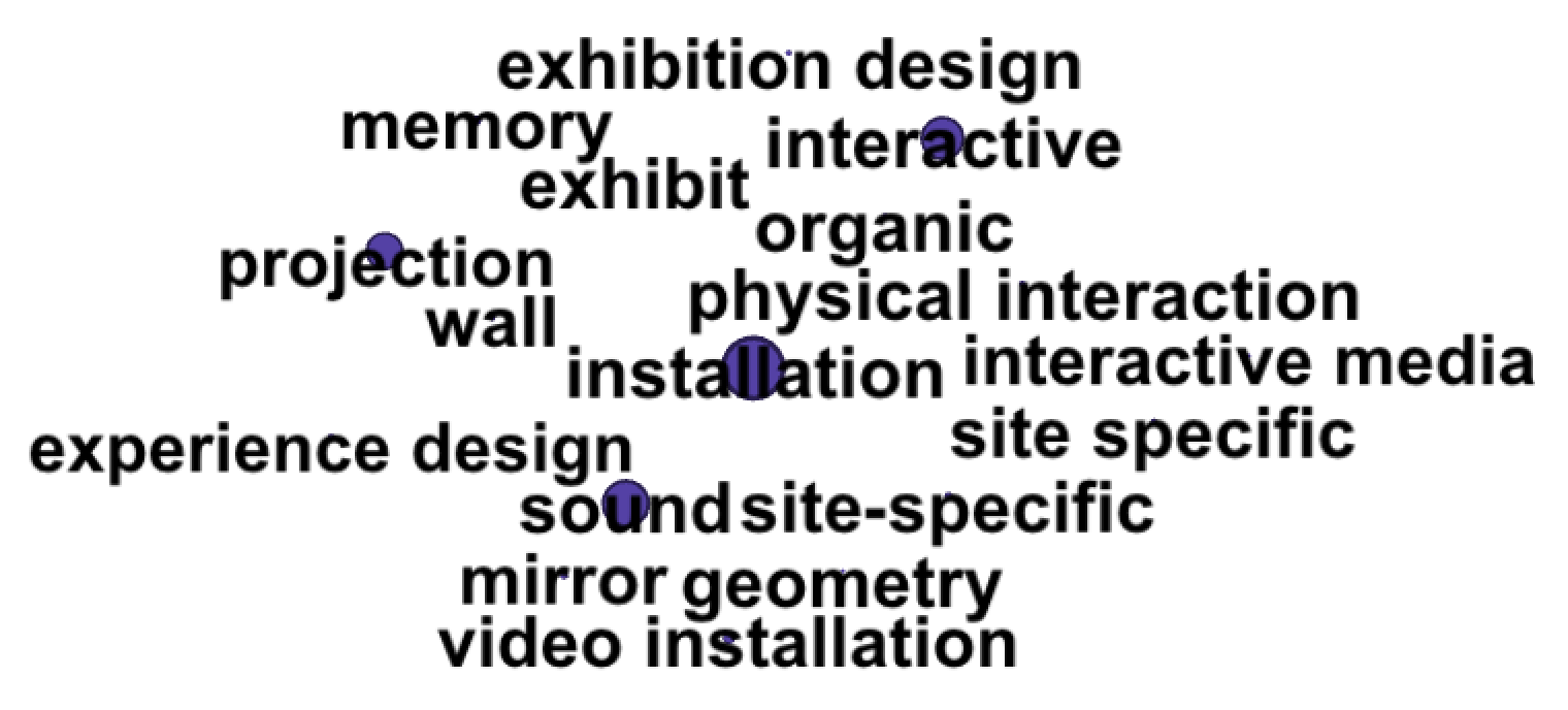 Installations and exhibits are a continual thread through our projects. It’s interesting to find so many of these related tags in one community, distinct from the visual arts tag community seen earlier.
Future Research into Tag Communities
A point of future research will be the time component of project tags. How do these communities change over time? What trends can be ascertained from these changing tags and tag communities? What velocities can be determined for those trends, and can we measure the effectiveness of these velocity predictions? Do those trends confirm things we already know, would they cause us to question our current trajectory, or do they open up new questions that we can examine and measure with the API or other tools?
People and Courses
Let’s turn to look at courses instead of projects. Let’s map out one dimension of interconnectedness between our students by looking at the courses they have taken together. The assumption here is that students who take a lot of classes together will have stronger social ties than those who take few classes together.
A unipartite undirected graph was created with a node for each person who has taken at least one course at ITP. Then, for each course, edges were created between all of the people who took that course. If an edge between two people already existed, the weight of the edge was incremented by 1. The modularity class algorithm was run on this graph to find strongly connected communities of people, and the result is visually surprising:
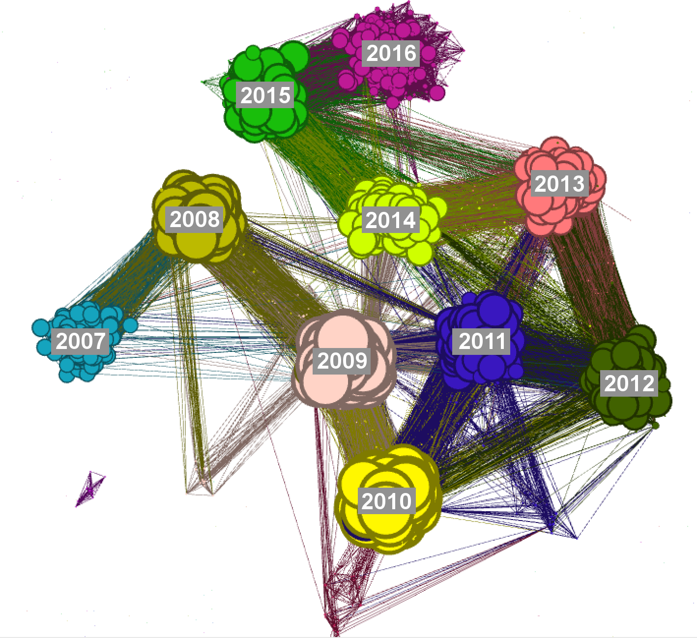
This strange combination of raspberries, blueberries, grapes, and some kind of worm-like structure connecting the clusters actually shows with great clarity one aspect of ITP, one which seems at first to be a trivial point: we are a two year master’s program. Each incoming class tends to overlap with only two other class years. So the graph shows:
- The students of each class year are tightly connected with students of their own class year. This makes sense, because class of 2015 students tend to take mostly classes with other class of 2015 students. Also, a member of a class year tends to take two courses with the entire class year (one course called Applications at the beginning of the program, and Thesis at the end of the program). This guarantees that every student in a class year will have at least one connection to every other student in that year.
- Each class year is connected to the students one year ahead and behind them. Obviously, the strongest connections are within a class year, but interconnection between adjacent class years is still fairly strong. Class of 2015 students tend to take some classes with class of 2014 students, and some classes with class of 2016 students.
- There is a sharp drop in interconnected students beyond one class year in either direction, and virtually no connections at a distance of two or more class years. However, in each year, there are usually only a few students who do not graduate within two years. These students are connected to a larger number of a students than the normal range. For example, I came into ITP as a student with the class of 2014, but I will actually graduate with the class of 2015. That means that I am likely to have taken classes with students from four separate class years, while the typical class of 2014 student only took classes three class years. In fact, there are several students who have been at ITP much longer than two years, and this handful of students is connected to many more students for this reason.
Future Focus, or Memory Loss?
I have heard both Clay Shirky (ITP faculty) and Dan O’Sullivan (ITP chair) describe this phenomenon as follows: the two year structure of ITP makes us good at focusing on the future by making it easy to break with the past. For example, it has been very common for the program to switch tools and approaches to match changes in the the art and tech worlds around us. People who graduated three years ago might find it surprising that the programming language Ruby (once the primary web programming language at ITP) is almost non-existent in courses and student projects now. And—who knows?—people who graduate three years from now might not ever learn Processing in Java, if p5 and JavaScript continue their ascendance. Whatever happens, ITP will adjust, and that adjustment is likely to take about three years. There’s obviously a potential downside to this as well (which I’ve written about elsewhere), that the two year structure also makes it very easy to forget important bits of history and culture. Finding the right balance between these two is a concern that many students, faculty, staff, and alumni take seriously, and I hope that this visualization contributes to that discussion in a constructive way.
Diversity of Interconnection
One other analysis has come from our first round of inquiry into this data. An early question in creating the graph of student interconnectedness via course enrollment was “who is the most interconnected student?” Though the answer seems obvious once revealed, like many questions in data analysis it opens up more tantalizing questions. The answer is simple: students who are here for longer than two years are dramatically more connected, as far as this graph is concerned. But a far more interesting question comes from looking at the highly interconnected students who are not here for longer than two years. What makes those students more likely to share courses with a more diverse set of students? Is it just an accident that they are more interconnected, or is there something about their background, or their course choices, that makes them more interconnected? This is a point of future research.
Access to the API
The first release of the Reflection API is currently only available to full time faculty and staff of ITP, but soon we expect to release a version to students and possibly alumni, pending implementation of the requisite privacy controls. It is our hope that as this API grows, our community will use it to build new tools that strengthen our interrelationships and tell the stories reflected in the data.
The code is available via Git at github.com/ITPNYU/reflection . Access to the code is provided for instructional and research reasons. Having the code will not give you access to the API.
Credits
Much of Reflection was developed by Karl Ward (that’s me!), building on earlier major work by John Schimmel, Shawn Van Every, and Dan O’Sullivan. This project would not have been possible without the large and small contributions of many people at ITP, including:
Ali Sajjadi Clay Shirky Dan O’Sullivan Dan Shiffman Edward Gordon Gilad Lotan John Schimmel Jon Wasserman Katie Adee Rob Ryan Sam Lavigne Sam Slover Shawn Van Every Steve Klise Surya Mattu Tom Igoe
Reflection was built using the following wonderful open source tools:
Flask Web Microframework Flask-Restless Web API Builder PostgreSQL Relational Database Python Programming Language Python SQLAlchemy Object Relational Mapper
The network analyses and visuals in this essay were created using:
Gephi Graph Visualization Program Gilad Lotan’s Code from the Social Data Analysis ITP course GNU GIMP Python NetworkX Library